Introduction
In this article, we’ll cover using of various element presentation methods, as well as their reuse and dynamic changing. The basics of working with collections and auto layouts are not covered here.
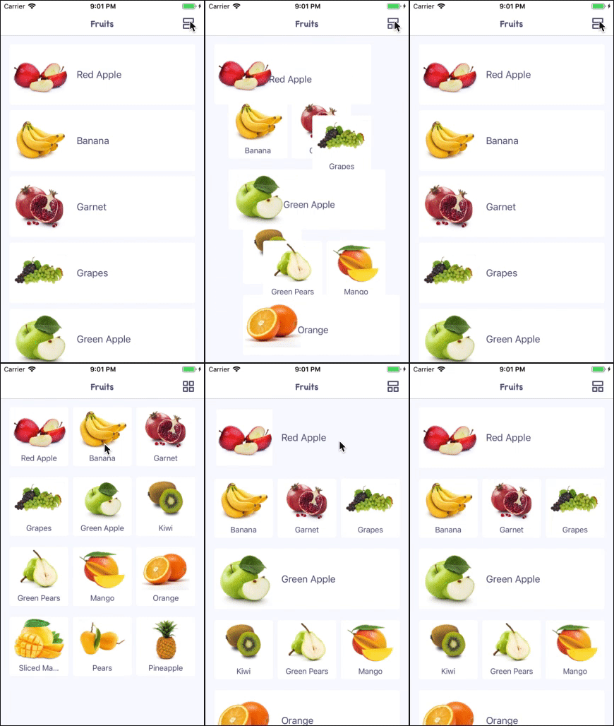
Here what we’ll get as a result:

When developing mobile applications, we often come across situations, where table view is not enough and we need to show element list in a more unique and interesting way. Moreover, the ability to change the display format can become a killer feature of your app.
You can implement all aforementioned fairly straightforward using UICollectionView and various UICollectionViewDelegateFlowLayout protocol implementations.
You can find the complete project code at https://github.com/IndeemaSoftware/CustomCollectionLayout
To implement the different display formats for our element list, we need:
- FruitsViewController: UICollectionViewController class, where we’ll store the fruits array, the UICollectionView and element presentation objects.
- Fruit data model
struct Fruit {
let name: String
let icon: UIImage
} - FruitCollectionViewCell: UICollectionViewCell class
A cell with UIImageView and UILabel elements for displaying fruits.
We’ll create this cell in a separate .xib file to be able to reuse it in other collection views.
As we can see from the design, there can be 2 cell alternatives with text featured to the right and below the image:


There could be absolutely different types of cells. In that case, you’ll need to create 2 separate object classes and use the suitable one.
For this example, we don’t need such distinguishing and 1 cell with UIStackView is enough.
1.FruitCollectionViewCell interface

To create cell interface:
- Add UIView.
- Inside the UIView, add UIStackView (horizontal).
- In the UIStackView, add UIImageView and UILabel.
- For UILabel, set horizontal and vertical Content Compression Resistance Priority = 1000.
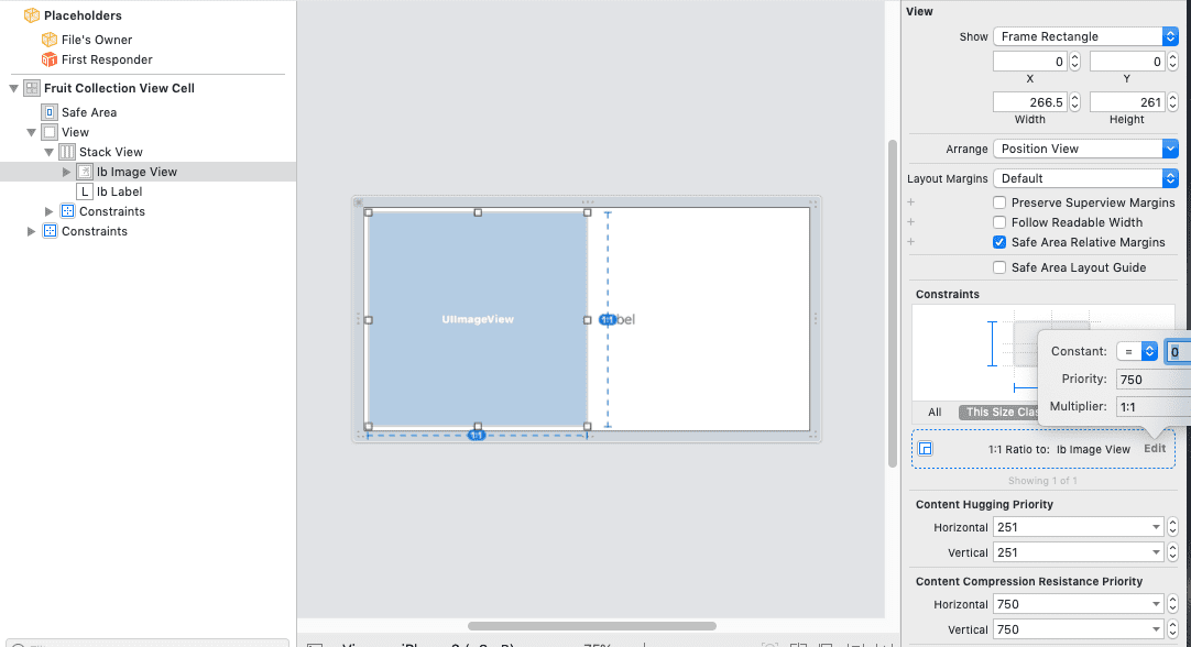
- For UIImageView, add Aspect Ratio 1:1 and change the priority to 750.
We’ll need this for accurate display in horizontal mode.
Next, we’ll write the logic for displaying your cell both in horizontal and vertical modes.
We’ll take the cell size as the main criterion for horizontal display. That is, if there’s enough space, we’ll display it horizontally. As “enough space” we’ll consider the width being twice the height, because the image should be a square.
Here’s the code for the cell:
|
class FruitCollectionViewCell: UICollectionViewCell { |
Let’s get to the main part and set up the controller and logic behind displaying and switching the cell types.
We’ll create enum PresentationStyle for all possible presentation states. To the navigation bar, we’ll also add a button for switching between states.
| class FruitsViewController: UICollectionViewController { private enum PresentationStyle: String, CaseIterable { case table case defaultGrid case customGrid var buttonImage: UIImage { switch self { case .table: return imageLiteral(resourceName: "table") case .defaultGrid: return imageLiteral(resourceName: "default_grid") case .customGrid: return imageLiteral(resourceName: "custom_grid") } } } private var selectedStyle: PresentationStyle = .table { didSet { updatePresentationStyle() } } private var datasource: [Fruit] = FruitsProvider.get() override func viewDidLoad() { super.viewDidLoad() self.collectionView.register(FruitCollectionViewCell.nib, forCellWithReuseIdentifier: FruitCollectionViewCell.reuseID) collectionView.contentInset = .zero updatePresentationStyle() navigationItem.rightBarButtonItem = UIBarButtonItem(image: selectedStyle.buttonImage, style: .plain, target: self, action: #selector(changeContentLayout)) } private func updatePresentationStyle() { navigationItem.rightBarButtonItem?.image = selectedStyle.buttonImage } @objc private func changeContentLayout() { let allCases = PresentationStyle.allCases guard let index = allCases.firstIndex(of: selectedStyle) else { return } let nextIndex = (index + 1) % allCases.count selectedStyle = allCases[nextIndex] } } // MARK: UICollectionViewDataSource & UICollectionViewDelegate extension FruitsViewController { override func collectionView(_ collectionView: UICollectionView, numberOfItemsInSection section: Int) -> Int { return datasource.count } override func collectionView(_ collectionView: UICollectionView, cellForItemAt indexPath: IndexPath) -> UICollectionViewCell { guard let cell = collectionView.dequeueReusableCell(withReuseIdentifier: FruitCollectionViewCell.reuseID, for: indexPath) as? FruitCollectionViewCell else { fatalError("Wrong cell") } let fruit = datasource[indexPath.item] cell.update(title: fruit.name, image: fruit.icon) return cell } } |
The UICollectionViewDelegateFlowLayout protocol contains all data about display methods of collection elements. Therefore, to remove any implementations from the controller and create independent reusable elements, we create a separate implementation of this protocol for each presentation type.
However, we should take into account that:
- This protocol also defines the cell selection method (didSelectItemAt:).
- Some methods and logic are the same for all N display methods (in our case, N=3).
So we’ll create a CollectionViewSelectableItemDelegate protocol that will expand the basic UICollectionViewDelegateFlowLayout protocol. That protocol will determine the closure for cell selection and, if needed, any additional properties and methods (such as returning the cell type if different display types are being used). This will solve the first issue.
|
protocol CollectionViewSelectableItemDelegate: class, UICollectionViewDelegateFlowLayout { |
To solve the second one, the logic duplication issue, we’ll create a base class that will contain all common logic.
|
class DefaultCollectionViewDelegate: NSObject, CollectionViewSelectableItemDelegate { |
In our case, the common logic includes the closure call when selecting a cell as well as cell background change when switching to highlighted state.
Next, we’ll describe 3 presentation implementations: tabular, 3 elements per each row, and a combination of the first two.
2. Tabular presentation
|
class TabledContentCollectionViewDelegate: DefaultCollectionViewDelegate { |
3. Displaying 3 elements per row
|
class DefaultGriddedContentCollectionViewDelegate: DefaultCollectionViewDelegate { |
4. Combination of tabular and 3-per-row presentation options
|
class CustomGriddedContentCollectionViewDelegate: DefaultCollectionViewDelegate { |
On the last stage, we add display data to the controller and set the appropriate delegate for the collection.
Important notice: since the delegate of the collection is weak, in the controller, we need to have a strong reference to the presentation object.
In the controller, let’s create a dictionary of all available presentation types:
|
private var styleDelegates: [PresentationStyle: CollectionViewSelectableItemDelegate] = { |
Also, to the updatePresentationStyle() method, let’s add animated changing of collection delegates.
|
collectionView.delegate = styleDelegates[selectedStyle] |
That’s all we need to animate switching of elements from one state to another ;)

Using this approach, we are able to display elements on any screen in any manner and dynamically switch between presentation states. The most important point is that the code is loosely coupled, reusable, and scalable.
You can find the complete project code at https://github.com/IndeemaSoftware/CustomCollectionLayout

